Bathroom Updates.
I still have to replace some caulk, seal the grout, and hang a couple towel hooks on the back of the door, but it was time to pull the trigger on shooting it for Design Sponge so I may as well let you in on what I’ve done.
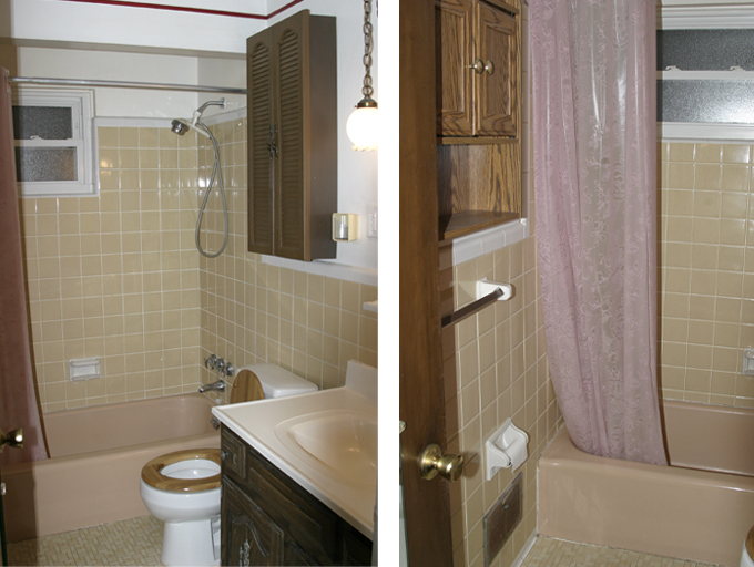
If you remember, the bathroom looked like a moldy tortilla put in a blender on HIGH when I moved in 11 years ago.
I like a lot of original 1950s tile, but that tile was U.G.L.Y. Seven or eight years ago we took the entire bathroom down to the studs, except for the tub which we had resurfaced, and installed new tile, fixtures, lighting, and drywall. In this post I talked about my “builder basic” thought process for the remodel and why I regret some of those decisions. I truly wish I had chosen a more classic/sophisticated tile, but let’s chalk it up to a learning experience, eh? Several years after that, the bathroom was ready for a refresh.
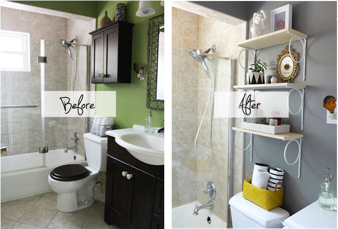
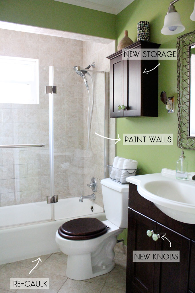
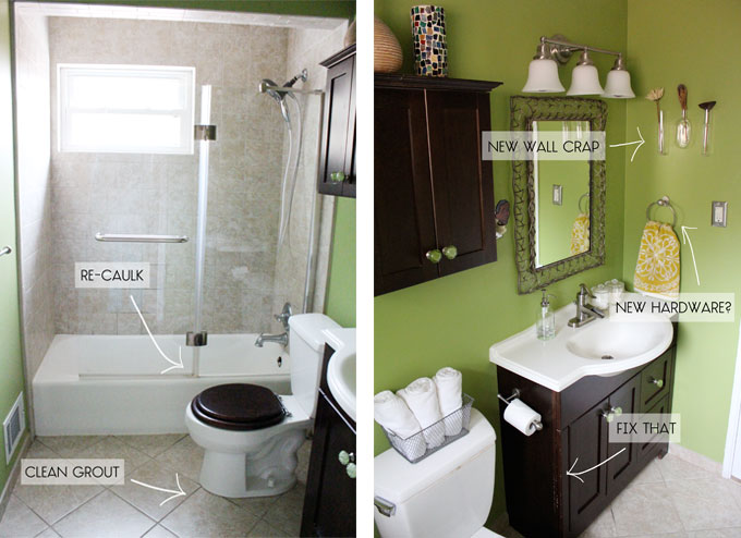
Man, was I waaaaaay over that moss green color. If I learned anything while living in this house, it’s how important it is to pick a whole house color palette. When I first moved in, I hastily picked a different color of the rainbow for each room without considering how they worked with each other. At one point the master bedroom was blue, the kitchen was yellow, the bathroom was green, and the dining room was turquoise. If you stood in the living room you could see all the colors in one glance and it was visually chaotic and jarring. Now I understand that in a small house you want continuity and rooms that feel like they flow, not like they’re chopped up with different color schemes. I’ve been slowly repainting each room in varying tones of grey which work together without evoking that chaotic vibe. The result is that the house feels bigger, airier, and more connected. Repeating the same color in multiple rooms may seem boring, but it doesn’t have to be. You can make things more interesting by pulling in colors and textures from furniture, art, pillows, rugs, etc. And if you don’t want to repeat the exact same wall color, sliding one or two shades lighter or darker on the same paint chip will ensure your rooms will feel connected and cohesive.
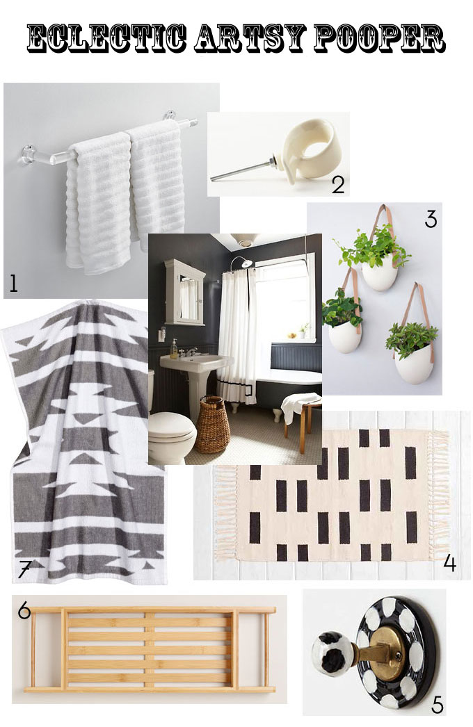
And so! Back in July of last year I created a mood board for how I wanted to spruce up the loo (OMG has it really been over a year since I started talking about this?! Am I 37 or 38 now? Did I do my taxes? Is Downton Abbey back on? Where am I?).
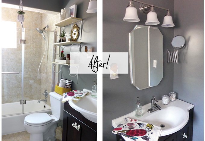
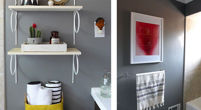
No expensive upgrades, just a refresh with some paint/accessories/shelves/textiles. Here’s where we are now.
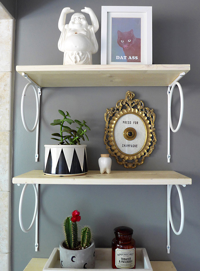
I wanted to bring a little personality and kitsch into the room because where’s the fun in decorating if you can’t express your inner crazy lady? I just think a cat checking out your butt (literally) is funny. And a large feminine abstract is slightly off-putting in this context.
The color I chose for the walls is Ominous Cloud by Clark & Kensington but I had it color matched to Valspar’s Zero VOC paint. This tone of grey works great in here at all times of the day. It doesn’t turn blue, purple, or brown like a lot of greys do under artificial lights. I decided to add open shelving above the toilet because look at my cute stuff! And I switched out the old mirror for a medicine cabinet with hidden storage because don’t look at my ugly stuff! The unfinished pine shelves were super cheap ($3.99 a piece) from Ikea. I brushed on two thin coats of white stain and two coats of poly before hanging them. I added plants and various textiles to warm up the space and to make me look like a kinder, warmer person. I’m also so glad I decided to splurge on the acrylic towel bar and toilet paper holder. I don’t know, they’re kinda glamorous. Just like you.
xoxo
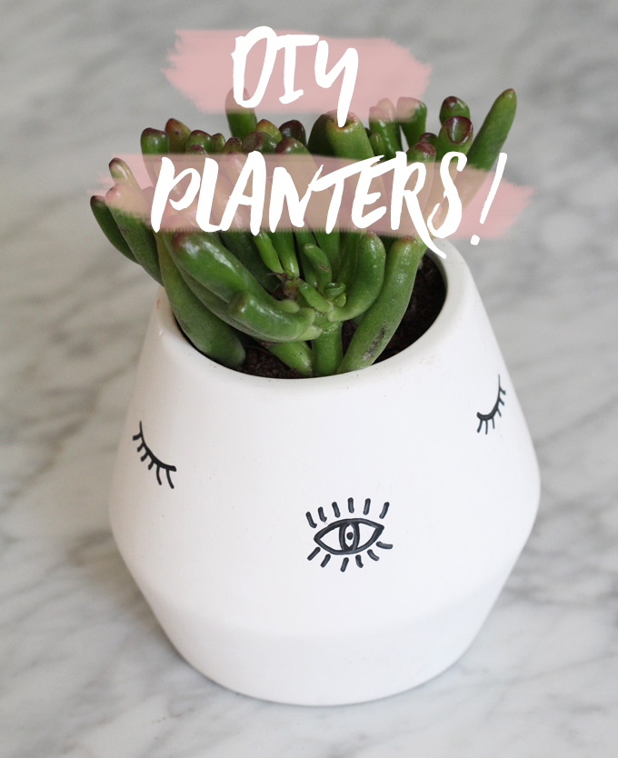
Sources! shelves, white stain, brackets, moon & eye planters, nightlight, press for champagne, towel bar, hand towel, candle, tooth trinket, Turkish towel and yellow basket (souvenirs from Spain), black & white pot and incense holder (vintage), marble tray (Homegoods), graphic art print (purchased from an art show in Detroit, artist unknown).
September 17, 2015
This entry was posted in Decorating, DIY Projects and tagged acrylic, anthropologie, bathroom bathroom makeover, cb2, dat ass cat, glass action, ikea, lisa golightly. Bookmark the permalink.









I love this bathroom! Did you get the white brackets for the shelves from Ikea as well?
Thank you! Yes I did.